Mir Factory
Mir Factory sells fabric and half its customers arrive on a phone. The old site was a catalogue: the products were there but nobody could find the fabric they wanted. Customers in the shop were opening the site and asking which one was which.
Before any design we wrote down which pages the visitor actually needs and what the text on them should say. Then we built the interface inside the brand's own system rather than inventing a new visual language. The site was handed over with an admin panel the client's own staff use to add products.
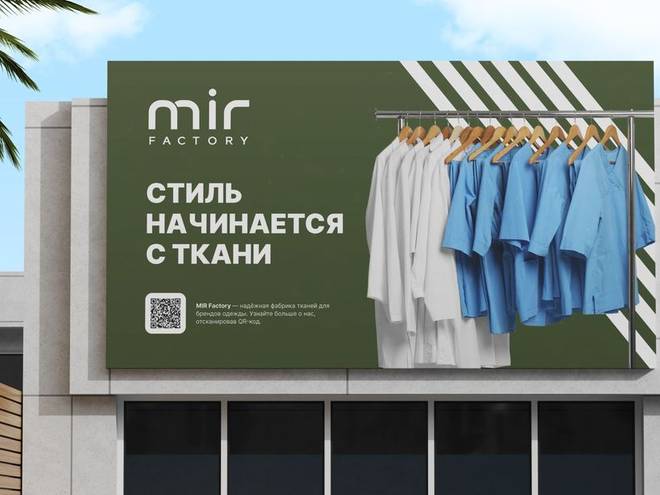
The hoarding on the shop front and the home page say the same sentence: style starts with the fabric. The QR code on the hoarding goes straight to the collection, so somebody walking past sees the product without coming in.
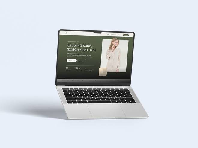
The home page is a filter, not a catalogue. Fabric type, weight and colour narrow in three clicks. Each product card carries a macro shot of the weave next to the photograph, because in fabric that is what the decision is made on.
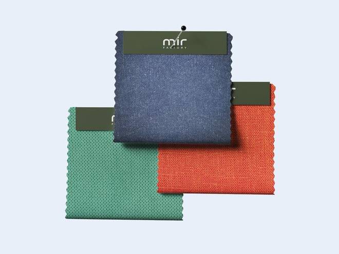
In fabric the decision is made on the weave, not the photograph. Every product card carries a macro shot of the cloth so the buyer can judge the weight by eye. On mobile the price per metre and the stock sit on the first screen, because a phone visitor decides without scrolling.
Complete brand identity
It starts with the mark and the guidelines. It carries on into packaging, uniform, social media, interiors and promotional items. Twenty-four deliverables, all production-ready.
- Logo and variations
- Usage guidelines
- Colour and type
- Cards and stationery
- Social media templates
- Packaging and labels
- Uniform and workwear
- Signage and storefront