Proton
Proton came to us for a logo. They had a mark already, but it fell apart in the field: one version on a jacket, another on a van, a third on an invoice. The bigger the company grew, the more interpretations every new order produced.
So we redrew the mark and then built the system around it. Writing the rules was not enough; we applied them ourselves to the workwear, the fleet, the stationery and the signage. The company holds working examples that can be copied exactly, not an abstract manual. Six months later nobody had to ask us anything.
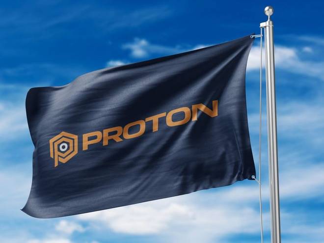
We tested the primary mark on the hardest surface there is: a flag in the wind. If the hexagon holds together here it will hold on a door sign and in a sixteen pixel favicon. The orange was chosen to separate from the navy at distance.
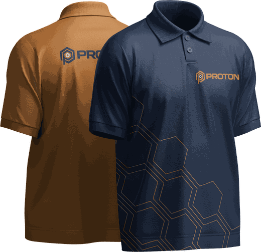
Two polos: orange for the field crews, navy for the office and client meetings. The chest mark is simplified for embroidery, its thin strokes thickened. The hexagon pattern along the hem prints in one colour, so every supplier returns the same result.
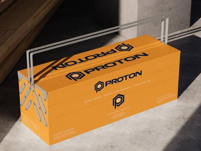
The product box is built for single colour print. The pattern inside the lid creates a second brand moment, the one that happens on opening. The dieline and bleed went to the supplier with the specification: reordering does not need a designer.
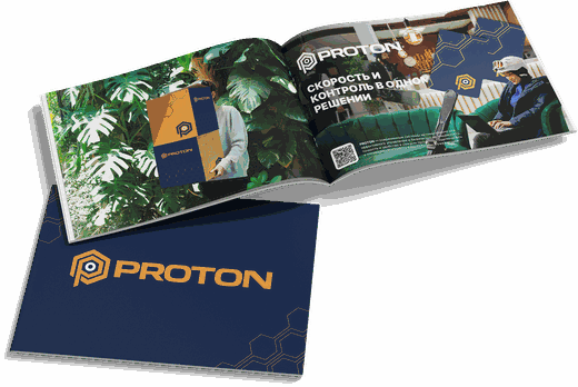
A technical company's brochure is an information problem first. We built the layout around product groups, so each spread answers one question the reader actually has. The type system is reduced to three levels: heading, technical data, footnote.
Complete brand identity
It starts with the mark and the guidelines. It carries on into packaging, uniform, social media, interiors and promotional items. Twenty-four deliverables, all production-ready.
- Logo and variations
- Usage guidelines
- Colour and type
- Cards and stationery
- Social media templates
- Packaging and labels
- Uniform and workwear
- Signage and storefront