Smash Burger
Smash Burger started with one idea: make the burger the way we would want to eat it ourselves. When the founders arrived they had a name and a room. Everyone in the category was either dark wood and kraft paper or bright red and yellow, and neither described this kitchen.
We built the mark as a single colour stamp, because a paper bag and a napkin are where this brand lives most. Next to it we drew a walking burger character that works large on a wall, small on a bag and tiny on a sticker. The whole packaging system runs on two colours, which keeps print cost predictable.
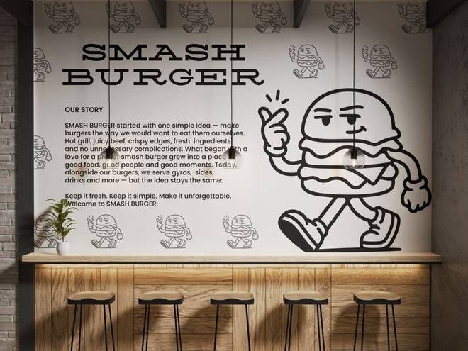
The back wall is both the brand story and a photo background. The character's poses are spread across it with a rhythm, so there is always one behind a seated customer. The text is set large enough to read from the till but light enough to recede in a photograph.
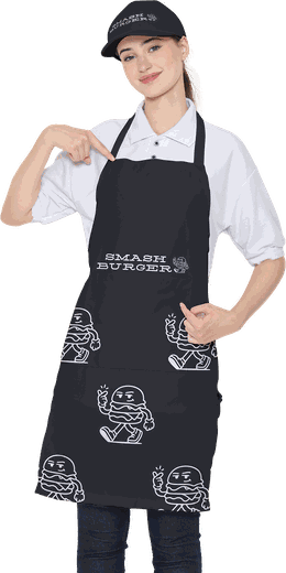
Black apron, one colour print. The pattern runs across the whole face; to stop it fading in the wash we kept the printed area small and picked a high contrast ink. The chest stamp is what makes the brand readable in staff photographs.
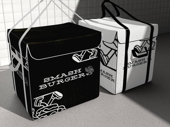
The courier box is black outside and white inside. Pattern on the body, stamp on the lid. It cuts from a single piece and closes without tape. The lid is left clear so the delivery team can shoot their own photographs.
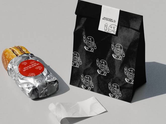
The bottle label, the sandwich wrap and the bag all run on the same two colours. The wrap pattern is deliberately light so it still reads through a grease mark. One colour on kraft is both the cheapest and the most durable option.
Complete brand identity
It starts with the mark and the guidelines. It carries on into packaging, uniform, social media, interiors and promotional items. Twenty-four deliverables, all production-ready.
- Logo and variations
- Usage guidelines
- Colour and type
- Cards and stationery
- Social media templates
- Packaging and labels
- Uniform and workwear
- Signage and storefront