Shine Clinic
Shine Clinic works in aesthetic gynaecology, and the category's real problem is trust. By opening, the space and the communication had to carry the same calm; the pink and the loud promises the category is used to did not suit this clinic.
We built the system on warm neutrals and one signature mark. The space, the campaign and the social feed all speak in the same typography. The campaign carries one message and repeats it on every medium: the opening date.
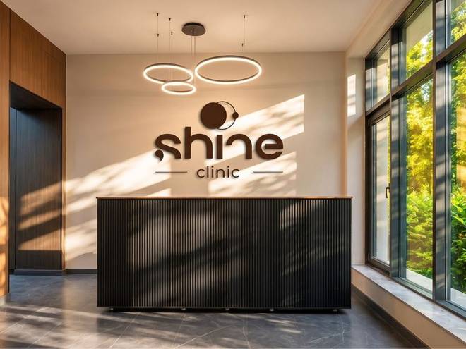
The mark behind reception is built in relief so it casts a shadow under the lighting. The materials are dark wood and matt black, and matt was chosen specifically so nothing flares under clinical light.

The city centre hoarding does one job: announce the date. The portrait holds the left half, the message the right. The type size was set by proofing at real scale, so it reads from a car at sixty kilometres an hour.

The same creative rebuilt for a narrow format. The photograph was not cropped but reframed, and the message came down to two lines. A campaign that looks identical in both places is what turns repetition into trust.
Complete brand identity
It starts with the mark and the guidelines. It carries on into packaging, uniform, social media, interiors and promotional items. Twenty-four deliverables, all production-ready.
- Logo and variations
- Usage guidelines
- Colour and type
- Cards and stationery
- Social media templates
- Packaging and labels
- Uniform and workwear
- Signage and storefront