StroyVershin
StroyVershin hauls construction materials, and its brand is seen on the road more than anywhere else. As the fleet grew each vehicle was wrapped by a different shop, and ten trucks started to look like ten different companies. They came to us asking us to make them all the same.
We reduced the mark to a single colour silhouette, because on a wrap that is the most durable answer. Then we drew a dimensioned wrapping scheme for the fleet: on a vehicle of each size, where the mark goes and how large. It went to the wrapping shop with measured drawings and a colour code.
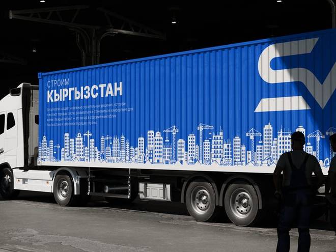
The trailer side is the brand's largest surface. The mark sits in the right third, because that is the zone visible longest as the vehicle passes. The city silhouette along the bottom is cut vinyl in one colour: cheaper than print and longer lived in the sun.
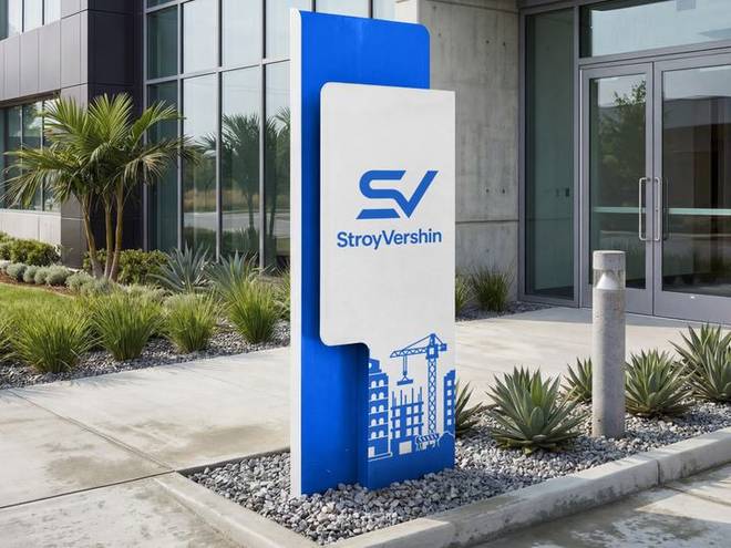
The pylon at the yard entrance is double sided so it reads from both directions. Back lighting was chosen for night, with the inside of the mark left open so the light comes only out of the letters.
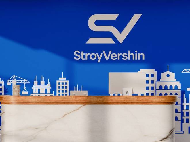
The reception panel brings the same city silhouette from the trucks indoors. A client recognises the truck they saw on the street once they are in the office, and that is exactly the moment the system pays for itself.
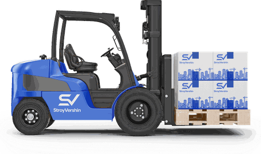
A small scale version was drawn for forklifts and yard machines. On a small surface the city silhouette is dropped and only the mark remains: the system gets richer large and simpler small.
Complete brand identity
It starts with the mark and the guidelines. It carries on into packaging, uniform, social media, interiors and promotional items. Twenty-four deliverables, all production-ready.
- Logo and variations
- Usage guidelines
- Colour and type
- Cards and stationery
- Social media templates
- Packaging and labels
- Uniform and workwear
- Signage and storefront